Hướng dẫn cách làm hiệu ứng tuyết rơi cho website
Hiệu ứng tuyết rơi thường được sử dụng để tạo ra bầu không khí mùa đông vào các dip lễ giáng sinh (Christmas, Xmas hay Noel). Hiệu ứng tuyết rơi có thể được tạo ra theo nhiều cách khác nhau.
Hôm nay ITC Today sẽ hướng dẫn các bạn cách làm hiệu ứng tuyết rơi cho web đơn giãn nhất.

Bước 1: chèn đoạn html sau vào trong thẻ <body>
<div class=”snow_container”>
<div class=”snowflake”></div>
</div>
Bước 2: tạo file css với tên “tuyet-roi.css” hoặc bạn đặt tên gì tùy thích, sao cho dễ nhớ.
Sau đó bạn copy và dán mã css này vào file tuyet-roi.css
.snow_container {position: fixed;width: 100%; height: 1000vh; top: 0px;}
.snowflake, .snowflake:before, .snowflake:after { position: absolute;top: -650px;left: 0;right: 0;bottom: 0; content: “”; background-image: radial-gradient(5px 5px at 50px 150px, #845EC2, transparent),radial-gradient(3px 3px at 100px 200px, #D65DB1, transparent),radial-gradient(4px 4px at 150px 450px, #FF6F91, transparent),
radial-gradient(5px 5px at 200px 50px, #FF9671, transparent),radial-gradient(3px 3px at 250px 250px, #FFC75F, transparent),radial-gradient(4px 4px at 300px 350px, #F9F871, transparent),
radial-gradient(5px 5px at 350px 300px, #FF8066, transparent),radial-gradient(3px 3px at 400px 400px, #FEFEDF, transparent),radial-gradient(5px 5px at 450px 500px, #00C9A7, transparent);
background-size: 650px 650px;animation: snowflakeAnimation 3s linear;animation-iteration-count: infinite; }.snowflake:after {margin-leFt: -200px;opacity: 0.5;filter: blur(2px);animation-direction: reverse;animation-duration: 6s; }
.snowflake:before {margin-leFt: -300px;opacity: 0.7; filter: blur(1px); animation-direction: reverse; animation-duration: 9s; }@keyframes snowflakeAnimation {from {transform: translateY(0);}
to {transform: translateY(650px);}
}
Với đoạn code trên bạn có thể tuỳ biến như sau:
.snow_container {
position: fixed; //vị trí hiển thị (lúc nào cũng nằm trên 1 màn hình)
width: 100%; // chiều rộng full 100% màn hình
height: 100vh; // chiều cao full 100%
top: 0px; // vị trí top màn hình
}
Để thay đổi màu sắc, kích cỡ của hạt tuyết:
background-image: radial-gradient(5px 5px at 50px 150px, #845EC2, transparent),
radial-gradient(3px 3px at 100px 200px, #D65DB1, transparent),
radial-gradient(4px 4px at 150px 450px, #FF6F91, transparent),
radial-gradient(5px 5px at 200px 50px, #FF9671, transparent),
radial-gradient(3px 3px at 250px 250px, #FFC75F, transparent),
radial-gradient(4px 4px at 300px 350px, #F9F871, transparent),
radial-gradient(5px 5px at 350px 300px, #FF8066, transparent),
radial-gradient(3px 3px at 400px 400px, #FEFEDF, transparent),
radial-gradient(5px 5px at 450px 500px, #00C9A7, transparent);
Bước 3: gọi lại file css vừa tạo trong thẻ <head>
<!DOCTYPE html>
<html lang=”en”>
<head>
<meta charset=”UTF-8″>
<meta http-equiv=”X-UA-Compatible” content=”IE=edge”>
<meta name=”viewport” content=”width=device-width, initial-scale=1.0″>
<title>Hiệu ứng tuyết rơi cho website</title>
<link rel=’stylesheet’ href=’duong-dan-luu-tru-file-css/tuyet-roi.css’ type=’text/css’ />
</head>
<body>
</body>
</html>
Và đây là toàn bộ mã nguồn bạn có thể tham khảo:
<!DOCTYPE html>
<html lang=”en”>
<head>
<meta charset=”UTF-8″>
<meta http-equiv=”X-UA-Compatible” content=”IE=edge”>
<meta name=”viewport” content=”width=device-width, initial-scale=1.0″>
<title>Hiệu ứng tuyết rơi cho website</title>
<link rel=’stylesheet‘ href=’duong-dan-luu-tru-file-css/tuyet-roi.css’ type=’text/css‘ />
<style>.snow_container {position: fixed;width: 100%;height: 1000vh;top: 0px;}.snowflake,.snowflake:before,.snowflake:after {position: absolute;top: -650px;left: 0;right: 0;bottom: 0;content: “”;
background-image: radial-gradient(5px 5px at 50px 150px, #845EC2, transparent),
radial-gradient(3px 3px at 100px 200px, #D65DB1, transparent),
radial-gradient(4px 4px at 150px 450px, #FF6F91, transparent),
radial-gradient(5px 5px at 200px 50px, #FF9671, transparent),
radial-gradient(3px 3px at 250px 250px, #FFC75F, transparent),
radial-gradient(4px 4px at 300px 350px, #F9F871, transparent),
radial-gradient(5px 5px at 350px 300px, #FF8066, transparent),
radial-gradient(3px 3px at 400px 400px, #FEFEDF, transparent),
radial-gradient(5px 5px at 450px 500px, #00C9A7, transparent);background-size: 650px 650px;
animation: snowflakeAnimation 3s linear;
animation-iteration-count: infinite;
}.snowflake:after {margin-leFt: -200px;opacity: 0.5;filter: blur(2px);animation-direction: reverse;animation-duration: 6s;}
.snowflake:before {margin-leFt: -300px;opacity: 0.7;filter: blur(1px);animation-direction: reverse;animation-duration: 9s;}
@keyframes snowflakeAnimation {from {transform: translateY(0);}
to {transform: translateY(650px);}
}
</style>
</head>
<body>
<div class=”snow_container”>
<div class=”snowflake”></div>
</div>
</body>
</html>
Chúc bạn thành công!
Theo: tuanchung
Nguồn: BlogTinHoc247
- Chia sẻ :


Cách sửa lỗi thông báo Adobe hết hạn bản quyền
28/12/2023bởi Phương Anh
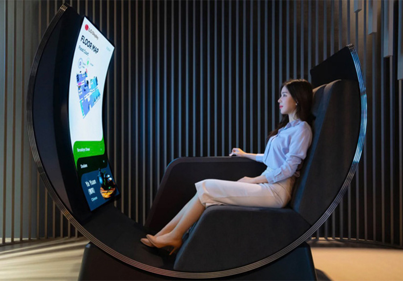
LG giới thiệu hai màn hình như sản phẩm đến từ tương lai
28/12/2021bởi Đàm Hằng
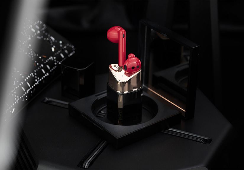
Huawei ra mắt tai nghe FreeBuds Lipstick tại VN: Thiết kế hình thỏi son, giá 4.9 triệu đồng
26/12/2021bởi Vũ Thụy
-
 Niềng răng khểnh bao nhiêu tiền? Thời gian bao lâu? 04:47 - 22/01/2024
 -
 Răng khểnh là gì? Răng khểnh đẹp hay xấu? 10:52 - 17/01/2024
 -
 2 cách làm cá tai tượng chiên xù giòn, thơm ngon chi tiết 04:37 - 03/01/2024
 -
 Từ 2024, những học sinh nào được miễn, giảm học phí theo quy định mới? 12:22 - 03/01/2024
 -
 VinFast VF 7 Hoả Long Độc Bản hết hàng sau 22 phút mở bán 12:14 - 03/01/2024
-
 Thấy gì sau vụ “học sinh vây chửi giáo viên”? 09:25 - 07/12/2023
 -
 Ranh giới giữa nhận thức giá và nhận thức thương hiệu 01:33 - 04/12/2023
 -
 5 giai đoạn hành trình khách hàng và các ví dụ nổi bật 08:29 - 01/12/2023
 -
 Đây là chiếc smartphone có cảm biến vân tay dưới màn hình tốt nhất hiện nay 10:32 - 06/06/2022
 -
 Tổng hợp mã lỗi máy giặt Electrolux thường gặp và cách khắc phục 07:18 - 26/09/2021


